
The most immediate improvement is the Liquid Glass opacity slider. While the design language introduced in iOS 26 felt divisive, this new control allows users to toggle tab bars between a deep, readable tint and a transparent, glassy aesthetic. It turns a static design choice into a functional preference. Alongside this, Apple has subtly retouched its core app icons, adding texture and color adjustments that lend the home screen a more cohesive, professional feel.
First impressions of the iOS 27 developer beta
Hours after the iOS 27 developer beta hit the iPhone 16 Pro, the most hyped AI features remain locked behind a waitlist. Yet, moving past the missing intelligence, the refinement of existing interface elements suggests Apple is prioritizing polish and granular control over the radical shifts seen in previous years.
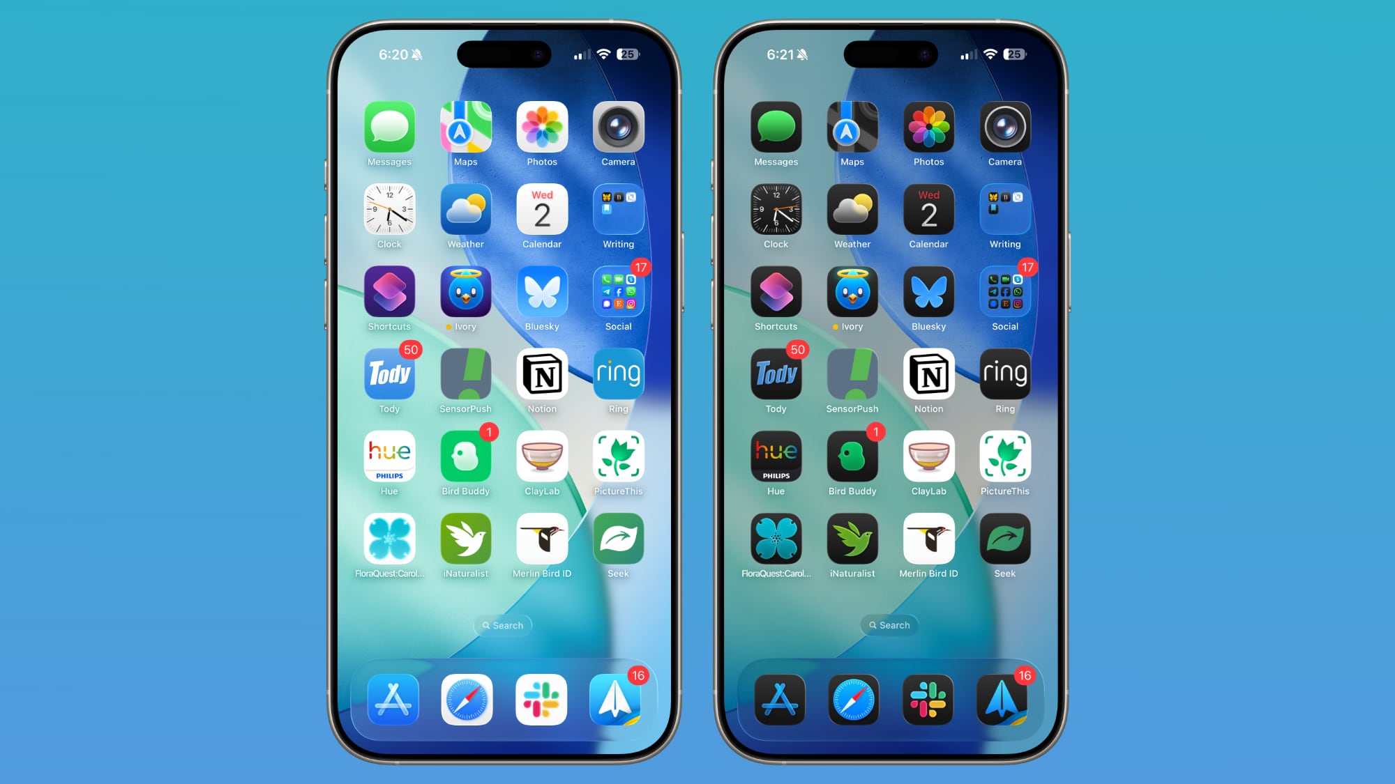
Functionality takes a front seat with long-overdue volume controls. Users can finally decouple ringtones from alarms, timers, and system alerts, ending the frustration of a loud system chime interrupting a quiet environment. For those who prefer a minimalist aesthetic, the Lock Screen now allows the clock to be shrunk and moved adjacent to the date, freeing up significant room for wallpapers. Rounding out the changes are the new extra-large widgets, which occupy an entire screen of space. While they are polarizing, their capacity to display full calendars or extensive to-do lists offers a genuine utility boost for power users.


Comments (0)
No comments yet. Be the first!